Keyboard Themes - Fonts, Emoji
- 4.6
- Rating
- 1.00M
- Installs
- Free
- Price
 Analysis by App-foxy
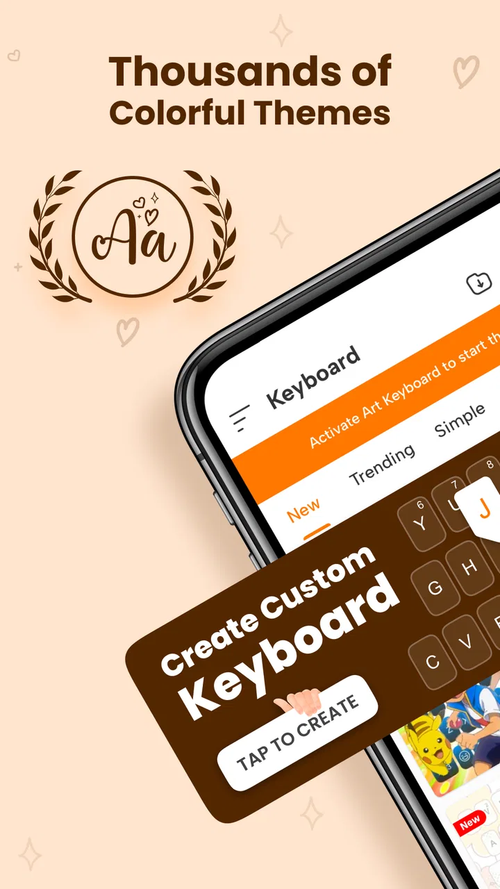
I spent time using Keyboard Themes - Fonts, Emoji as a personalization app rather than treating it like a simple keyboard replacement. Its main appeal is visual: it lets you change the look of your typing with themed designs, decorative fonts, emoji access, and custom styling. That makes everyday messages feel more personal, especially if you enjoy matching your keyboard to your mood, a social profile, or a particular conversation.
The important thing is to approach it with the right expectations. This is not primarily a productivity tool designed to transform serious writing. I see it as a way to make casual typing more expressive while keeping the familiar role of an on-screen keyboard. The free entry point is useful for trying the experience, although some users may eventually run into paid options priced at $6.99 per item. Whether that feels worthwhile depends on how often you actually use decorative themes and fonts.
My everyday starting point with the keyboard
My first recommendation is to begin with one restrained theme instead of immediately choosing the most elaborate design. A keyboard that looks exciting in a preview can become distracting when used for long messages. I found it more practical to choose a readable layout first, then test it in the apps where I normally type: a messaging conversation, a short note, and a search field.
You May Also Like

 Blood Strike: 2.5 Anniversary
Blood Strike’s Loadouts Turn Every Drop Into a Tactical Gamble
A close look at Blood Strike’s custom loadouts: how fast access to signature weapons reshapes its battle royale rhythm, rewards preparation, and narrows the gap between fights.

 Pandora - Music & Podcasts
Pandora’s Music Is Easy to Start, but Harder to Recover
Pandora’s strength is its low-effort path from a seed to a station. Its weak spot is how much confidence it asks you to place in connection, setup, and quiet recovery.

 8 Ball Pool
 Is Built on Rivalries, Rematches, and Routine
A close look at the rivalries, rematches, shared routines, and unanswered safety questions that turn a quick pool match into a persistent mobile community.

 Samsung Music
’s Quiet Strength Is Playing What You Already Own
Its reach comes less from spectacle than from dependable access to a personal library. That simplicity is both the app’s strongest retention engine and its ceiling.

 AccuWeather: Weather Radar
AccuWeather Review: A Quick, Clear Forecast for Everyday Decisions
For everyday plans, the best forecast is the one you can understand quickly. AccuWeather makes rain timing, radar, and local conditions easy to act on, with a few trade-offs.

 Hill Climb Racing
Why Hill Climb Racing Still Turns Crashes Into One More Run
A tiny car, a bumpy hill and one more upgrade: Hill Climb Racing keeps resurfacing because its simple chaos makes every near-miss feel personal.
More From Our News Desk



That simple routine reveals something the store summary cannot: a keyboard has to work in several contexts, not just look good in a screenshot. A bright background may be fun for quick chats but tiring when writing a longer paragraph. Likewise, an unusual font can add personality to a message while making text harder for another person to read. I prefer to treat decorative styles as a communication accent, not as the default for every sentence.
The app is particularly easy to understand if you divide your typing into two habits. For ordinary writing, I keep the design calm and readable. For greetings, captions, playful replies, or messages to friends who appreciate visual details, I switch to something more expressive. This approach prevents the novelty from wearing off and makes the themed keyboard feel useful instead of merely decorative.
Because the app is free to install, it is reasonable to experiment before deciding whether it deserves a permanent place on your device. It is aimed at Everyone, which fits its casual presentation and broad use. Still, younger users should be guided toward sensible typing habits, especially when using decorative characters in usernames, public posts, or school-related communication.
What the developer delivers well
AppLock Inc. has positioned this product around customization rather than trying to compete as a full writing assistant. That focus is clear in the combination of themes, fonts, emoji, and custom designs. I like that the experience is built around visible changes that users can understand quickly. You do not need to learn a complicated editing system to appreciate the basic purpose: choose a look, type, and decide whether it suits you.
The app has attracted over one million installs and holds a 4.6 average from around ten thousand ratings, which suggests that the visual concept connects with a substantial audience. I would not treat those figures as a guarantee that every device or typing style will feel identical, but they do indicate that this is more than an obscure experiment.
The current version is 17.0 and it works with Android 8.0 or later. That makes it accessible to people using older supported Android devices as well as newer phones. In practice, compatibility is only one part of the decision. Screen size, keyboard preferences, and how much you type each day matter just as much. Someone who sends a few casual messages may love the visual changes, while someone who writes long documents may value a more focused keyboard.
Settings I would check before making it my default
Experienced users should spend a little time checking the available keyboard and theme settings instead of accepting the first design they see. The most useful question is not “Which theme is prettiest?” but “Which theme lets me recognize keys quickly?” A good background contrast can make the keyboard feel comfortable, while a busy pattern can slow down touch typing even if it looks attractive.
I also recommend checking how the chosen font affects the text you send. Some decorative styles are best used for short phrases because they can be visually dense. If you use them in every message, readers may need extra effort to understand what you wrote. I use stylized text selectively, especially when the message contains names, addresses, times, or other details that should be instantly clear.
Emoji access is another area where a repeatable habit helps. Rather than opening the emoji panel for every small reaction, I keep a few familiar choices in mind and use them where they genuinely add tone. A single well-chosen symbol can clarify whether a short reply is friendly, teasing, or enthusiastic. Filling every message with decorative elements usually makes the keyboard’s personality less effective.
Custom designs are most useful when they solve a specific preference. For example, I might choose colors that are easier to distinguish in a dim room, or create a style that matches a personal visual theme. Customization is less valuable when it becomes a constant search through options. Once I find a design that is comfortable, I prefer to keep it for several days and judge it during real use rather than changing it repeatedly.
One practical check is whether the keyboard remains comfortable when your phone is held in one hand. A theme does not change the physical size of the keys, but visual contrast can affect how quickly you locate them. I test short replies while walking around the house, then longer text while seated. If a design only feels good when I look closely at every key, it is not a good everyday choice for me.
Faster patterns for people who type often
The fastest way to benefit from this app is to create a small routine around it. I choose one everyday theme, one playful theme, and one highly readable option. That gives me a practical choice for normal conversations, a more expressive choice for social messages, and a fallback when I need clarity. The point is not to maintain a huge collection; it is to avoid repeatedly rebuilding the same preference from scratch.
I also separate the visual keyboard from the words themselves. If I am writing something important, I draft the message normally and add a font or emoji only after the meaning is complete. This prevents the design process from interrupting the thought. It is a small habit, but it makes the app feel faster because customization becomes the final touch rather than part of every keystroke.
Another useful pattern is to reserve decorative fonts for text that benefits from emphasis. A short birthday greeting, a playful nickname, or a caption can gain character from a different style. A long explanation usually benefits more from ordinary readable text. This trade-off is easy to miss when browsing themes because previews naturally highlight the most dramatic examples.
For users who switch between personal and practical communication, I suggest making the change deliberately. Before sending a work-related message, an appointment detail, or a customer-service request, I return to a plain, legible style. That reduces the chance that a decorative character will be misunderstood or displayed awkwardly by the recipient’s device.
The same habit helps with copying and pasting. Stylized text may not behave like ordinary text in every destination, so I avoid using it for information that needs to be searched, edited, or reused later. A normal version is better for notes, forms, directions, and anything I may need to copy again. The app is strongest when its creative output is treated as presentation, not as a replacement for plain text everywhere.
Where the free experience fits
Since the app is free, I think the best approach is to use the no-cost experience as a trial of the overall idea. If you only want occasional visual changes, the free offering may be enough to satisfy you. If you enjoy changing themes frequently or want a broader range of custom styling, you may encounter in-app purchases at $6.99 per item.
I would not pay simply because a preview looks impressive. I would first ask whether the design improves something I do regularly. If I send many casual messages and care about personal expression, a purchase could make sense. If I mainly type emails, notes, passwords, or work documents, extra themes are unlikely to change my routine enough to justify spending.
This is also where the app differs from the usual alternatives. A standard system keyboard generally prioritizes predictable typing, familiar controls, and practical text entry. A dedicated font or theme tool focuses more on visual identity. Other personalization apps may concentrate on wallpapers, icons, or launchers, while this one changes a part of the phone you interact with repeatedly during communication.
That distinction is valuable, but it also sets a limit. A themed keyboard does not automatically make typing more accurate, writing more organized, or long-form composition more efficient. If your priority is advanced correction, serious multilingual work, or a highly refined productivity workflow, a mainstream keyboard built around those goals may be a better fit. I would use this app alongside a practical alternative if typing accuracy matters more than appearance.
Advanced limits that are easy to overlook
The biggest limitation is that personalization can compete with readability. Fonts and backgrounds are visual effects, and visual effects have a cost when the screen is small, lighting is poor, or the message is long. I found that the best-looking option is not always the easiest one to use. A design that feels perfect for a short greeting may become uncomfortable during a long conversation.
There is also a social limitation: the recipient may not experience the text exactly as you intended. Decorative characters can look different across apps, devices, or fonts. Even when the message arrives correctly, the style may not suit the context. I therefore avoid relying on unusual typography to communicate important meaning. If the wording matters, I make the wording clear first.
Another trade-off concerns consistency. If I change the keyboard every time I open a messaging app, I spend more attention on presentation than on conversation. The app rewards users who establish a small set of repeatable choices. It is less satisfying for someone who wants endless novelty but does not want to spend time managing that novelty.
I would also skip this app if you dislike changing your established keyboard habits. Switching keyboards can feel unnecessary when the default option already does everything you need. Likewise, people who use their phone mainly for formal writing may find the themes entertaining for a day but not useful enough to keep active.
On the other hand, the app is a strong match for users who care about profile aesthetics, casual messaging, emoji-heavy conversations, and small expressions of identity. It can be especially enjoyable for someone who sees the keyboard as part of the phone’s overall look rather than as an invisible utility.
How I would build a reliable routine
My preferred setup is deliberately simple. I start with a readable everyday theme, test it in several real conversations, and keep notes on what feels distracting. Then I add one more expressive design for moments when I want a stronger visual tone. This gives me variety without turning every message into a design decision.
When I want to use a decorative font, I write the message in ordinary language first. I reread it for clarity, then apply the visual treatment to a short section if it helps. This workflow is faster and safer than composing directly in an ornate style. It also makes it easy to remove the styling if the result looks crowded.
For emoji, I use them to support tone rather than replace words. A symbol can soften a brief reply, but it cannot always explain an ambiguous sentence. Combining a clear phrase with one relevant emoji usually works better than relying on a long sequence of symbols.
Finally, I keep practical communication practical. I use plain text for information that someone may need to copy, search, or understand quickly. Themed designs are reserved for moments where personality is the goal. That boundary is the most useful advanced habit I found because it preserves the app’s fun side without allowing it to interfere with everyday reliability.
My verdict after using Keyboard Themes - Fonts, Emoji
Keyboard Themes - Fonts, Emoji is best understood as a creative layer for everyday typing, not as a complete productivity replacement. I like the way it brings themes, fonts, emoji, and custom designs into a part of the phone that is normally overlooked. The experience is approachable, and the free price makes it easy to see whether visual keyboard customization fits your habits.
Its strongest users will be people who enjoy personal messages, expressive captions, and a coordinated phone aesthetic. They will get the most from choosing a few dependable styles and switching them with intention. The app is less convincing for heavy writers, users who prioritize advanced typing tools, or anyone who already feels perfectly served by a standard keyboard.
The rating of 4.6 from around ten thousand ratings and more than one million installs show that the concept has broad appeal, but my recommendation is still conditional: try it for the visual experience, judge it during real typing, and do not confuse a striking preview with lasting comfort. AppLock Inc. has made a focused personalization app, and it works best when I use it as a finishing touch for communication rather than forcing every message to look decorative.
If you want your keyboard to feel more like part of your personal style, I think it is worth exploring. If you want the fastest, clearest, most practical writing environment, keep your usual keyboard close at hand and treat this one as an optional creative switch. That balance lets the app do what it does well without asking it to solve problems it was not designed to solve.
FAQs for Keyboard Themes - Fonts, Emoji
01What features does the Keyboard Themes - Fonts, Emoji app offer?
The Keyboard Themes - Fonts, Emoji app provides an extensive range of customization options for your keyboard. Users can choose from a variety of themes, fonts, and emojis to personalize their typing experience. Additionally, the app offers auto-correct and predictive text features to enhance typing efficiency and accuracy.
02Is the Keyboard Themes - Fonts, Emoji app free to use?
While the Keyboard Themes - Fonts, Emoji app is free to download, it may offer in-app purchases for premium themes and additional features. These optional purchases can enhance the variety and functionality of the app, but users can still enjoy many features without spending money.
03How does the app affect my device’s performance and battery life?
The Keyboard Themes - Fonts, Emoji app is designed to be lightweight and efficient, minimizing impact on device performance. However, extensive use of animated themes or frequent updates may slightly affect battery life. Users are advised to monitor battery usage and adjust settings for optimal performance.
04Is the Keyboard Themes - Fonts, Emoji app safe to download and use?
The app is generally considered safe to download from trusted sources like the Google Play Store and Apple App Store. It adheres to standard privacy policies, but users should always review app permissions and ensure they’re comfortable with the data being accessed or shared.
05Can I easily switch back to my default keyboard after using this app?
Yes, switching back to your default keyboard is simple. You can change your keyboard settings through your device's settings menu. The app does not permanently alter your keyboard settings, allowing you to switch between keyboards as desired without any hassle.
Pros
- Wide variety of themes to customize.
- Includes unique emojis and fonts.
- User-friendly interface design.
- Regular updates with new features.
- Compatible with multiple languages.
Cons
- Contains in-app purchases for premium.
- Some themes can be overwhelming.
- Occasional ads interrupt usage.
- May slow down older devices.
- Limited free customization options.

Keyboard Themes - Fonts, Emoji
Gallery